No comic artist rules gestalt like Harvey Kurtzman, What is gestalt? It’s a German word, referring to how people look at things. There’s a whole bunch of methods to make a page easy to read, and draw attention.
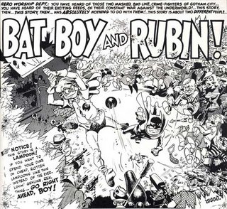
This panel is a great example. At first glance it looks too detailed, but at second glance, you get to follow the planned rhythm, and it gets very easy and fun to read. First you focus on the title “Bat Boy and Rubin” and then the two figures at the center. They’re surrounded by white (reflecting light) and drawn in black (absorbing light). The ass kicked villains follow a curve indicated by bat-boy’s punch swing. At the end, all links us to Wally Wood’s signature, at the bottom right part of the image. Wally’s done some of his most amazing work in the early days of Mad Magazine, the days when founder Harvey Kurtzman, drew “blueprints” or rough layouts, for each artist to follow.
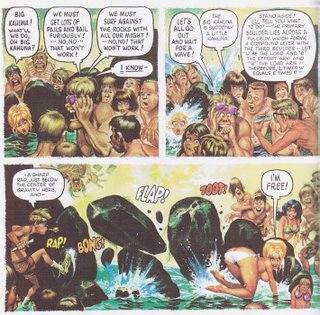
Here’s another treat, “Little Annie Fanny” is a comic Kurtzman did for Hugh Hefner, With Mad colleagues Will Elder, Jack Davis and Superman creators Siegel and Shuster. Before Playboy, Hefner was trying out as a cartoonist too. It was his idea to have it fully painted. And by the way, Al Jaffee has a famous take on Playboy’s “Centerfold”. Color prints were very costly at the time, and since mad always “worked in the opposite direction” the “Fold In” was born!


1 comment:
Post a Comment